Ayson ATS
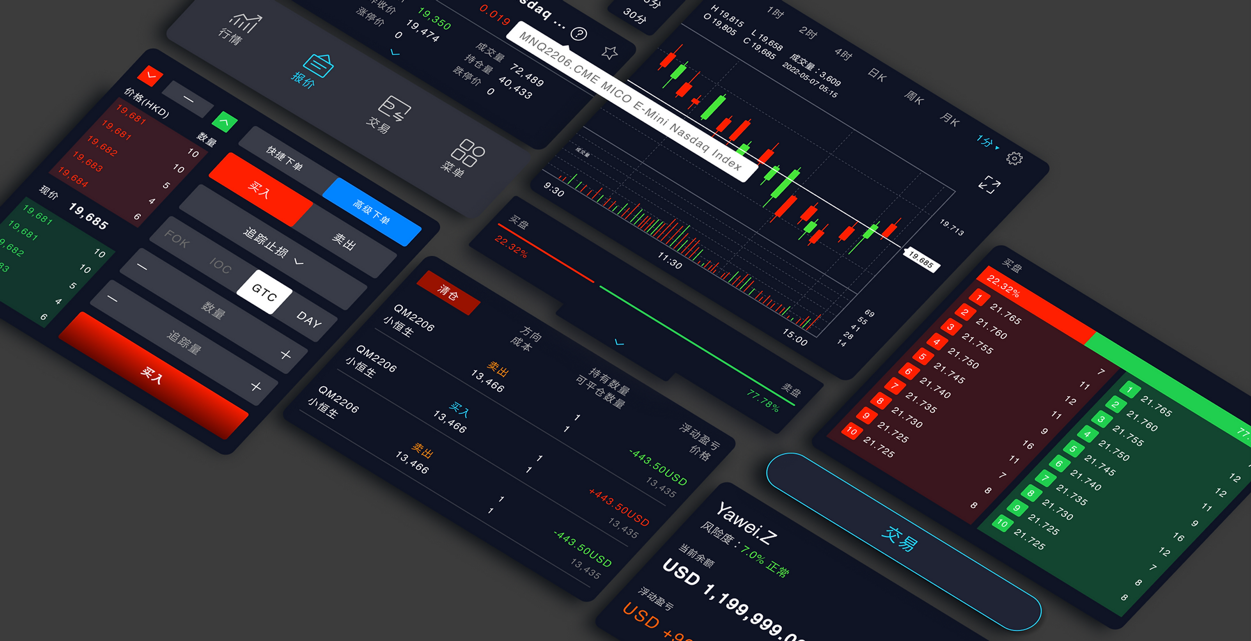
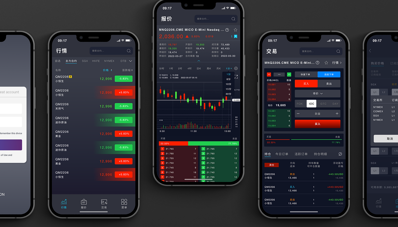
We used a combination of typography, color, and UI elements to create a professional yet approachable look. The typography we used was a mix of modern sans-serif fonts that provided a clean look and feel. We also used color to help differentiate between different areas of the UI. This helped users quickly identify which areas were related to stock trading and which were for other features. The UI elements we used were intuitive and straightforward, allowing users to easily navigate the system. We also added subtle animations to the UI to give it a more dynamic feel and to help guide users through the stock trading process. Overall, our UI design for ATS provided users with a simple, easy-to-use platform that was both aesthetically pleasing and functional. We were able to provide users with a trading experience that was both efficient and enjoyable.
-
I was hired by William Yawei & Partners to help with designing the user interface for a Ayson ATS.
-
Figma
-
4 Weeks